Don’t make bad diagrams
Professional reports are littered with bad diagrams. What’s a bad diagram? A diagram that exists for no good reason, that adds nothing of value for the reader, or worse makes things harder for them. These are particularly common in any kind of report that has a strategy. Take this example from the EU’s Sector Skills Strategy in Additive Manufacturing:
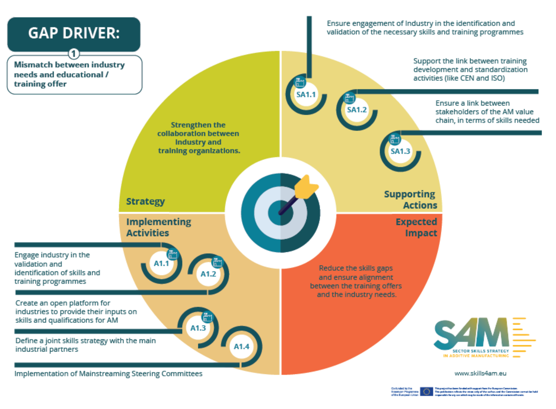
Is it eye-catching? Certainly. Does it contain useful information? Absolutely. Does it make that information easier to understand? No. It is a bad diagram.
A quick way to be able to tell is that your eyes have no idea where to go. Start in the top left and go clockwise? That means the key implementation activities are the last thing you read. Start in the top left, go down, then diagonally to top right then down to impact? Who knows? The diagram certainly does not give you any clues.
The information in this diagram would be much better presented very traditionally as some headings and some bullet points:
Gap driver: Mismatch between industry needs and educational / training offer
Strategy
...Supporting actions
- SA1.1...
Implementing activities
- A1.1...
Expected impact
...
But isn’t that much less eye-catching? Less suitable for a slide? Yes, but that must always be a secondary consideration to presenting the information in a way that is useful to the reader. Once we have done that we can think about adding back in some colour and icons in a way that will not compromise legibility.
J. Dudley